
SFS2X Docs / GettingStarted / admintool-Analytics-interface
» Analytics module | Interface
The Analytics interface features a few global controls and a number of tabs corresponding to different data views. Other than the general Overview, which shows the main metrics from other views, the following are available:
- Demographics, shows metrics split by geographical origin
- Technology, shows metrics split by client platform
- Application, shows metrics split by SmartFoxServer Zone
- Exceptions, shows metrics related to errors and warnings
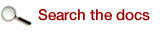
The structure of the interface is almost the same for all views: on a desktop, the main chart is at the top (D), the visitors pie chart/s below it (E), the metrics list at the bottom left (F) and an area for view-specific content is at the bottom right (G).
A Main buttons
The main Analytics buttons are located at the top right corner of the module. They allow to control the data range selection and data loading.
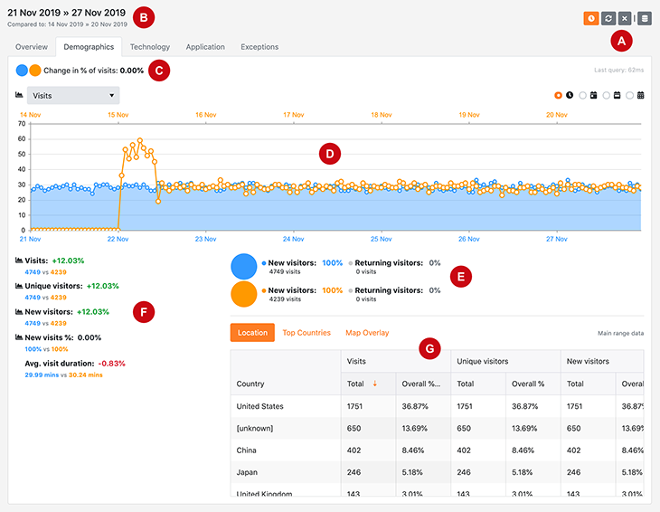
» Data range
The  button (Configure data range) opens a modal panel showing the data range selection controls:
When using Analytics, the first operation to do is selecting the data range to be displayed. You can then move from one view to another to look for the needed report.
The top dropdown contains a number of predefined intervals to easily access commonly used data ranges: today, yesterday, last week and last month. By default yesterday is selected.
Choosing the custom option enables the From and To fields, allowing the selection of any time interval down to the hour of the day.
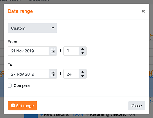
Clicking the Compare switch makes analytics display more controls:
It is now possible to select a secondary interval by shifting back the main one, in order to compare the metrics in different time periods. This modifies the behavior of the visits % chart (C), the main chart (D), the visitors charts (E) and the metrics list (F). Data corresponding to the main range is displayed in blue, while data corresponding to the comparative range uses an orange color.
Click on the Set range button to retrieve the data related to the selected time period/s.
» Stop
The  button (Stop after next) can be used to cancel the data retrieval process after setting the range or moving to a different view which requires an update. In fact, depending on the selected time span and data size, the retrieval can take a long time to process, as it requires multiple queries to be executed. So stopping it can be necessary sometimes.
Note that clicking on this button doesn't stop the query which is currently in progress, but prevents the server from executing the next ones within the same data request. So a delay before the Analytics interface is available again after clicking the button can still occur.
Statistics not retrieved due to request cancellation show a warning icon.
» Refresh
The  button (Refresh) can be used to refresh the view in case the stats retrieval was stopped before completion and some metrics show the warning sign. Analytics will load the missing data.
B Current range
The currently selected data range is displayed in the top right corner of the module, to the left of the main buttons. It shows the start date and end date of the selected time interval; if a custom interval is set and its From hour and/or To hour are different from 0 and 24 respectively, the  icon is displayed at the right of the range as a reminder.
If the Compare option is active in the range setup (see A), the secondary range is displayed below the main one in a lighter color.
C Visits percentage
The tiny pie chart at the top left corner of each view offers an immediate indication of the data subset which the current view is displaying, based on the Visits metric. A subset is displayed when a filter is applied to data (for example a country is selected in the Demographic view – see G).
This percentage represents the number of visits for the filtered data with respect to the overall visits for the selected time interval: 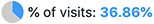
If the Compare option is active in the range setup (see A), two pie charts are displayed and the change in percentage of visits between the two intervals is reported: 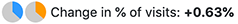
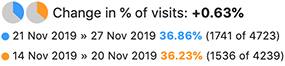
Clicking on the this element shows detailed information on the actual visits for the currently selected range/s:
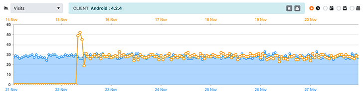
D Main chart
The main chart shows the detailed behavior of the metric selected in the dropdown over the current time interval/s. The data granularity can be set with the radio buttons at the top right: hourly, daily, weekly or monthly data. Depending on the time span one or more options might be unavailable (for example the hourly chart is available if the range is less than or equal to seven days).
If a filter is applied for the current view (see G), a box above the chart shows the selection:
Click on the  button (Remove sub-filter) if available to reduce the filter granularity (for example, in the Technology view remove the client version and just keep the client platform) and the
  button (Remove filter) to remove the filter completely.
E Visitors charts
All views, excluding the Exceptions one, show a specific pie chart under the main chart which offers an immediate representation of the percentage of new and returning visitors over the total number of visitors in the selected time interval. If range comparison is active, two separate pie charts are displayed.
Other than the two percentages, the total number of visits for the two categories is also displayed.
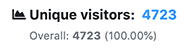
F Metrics list
The list located at the bottom left of each view contains the metric total values for the selected time period.
In views other than Overview, and if the range comparison is not active, in addition to the metric value for the selected period and filter, each item also shows the overall unfiltered value for that period and the percentage with respect to it:
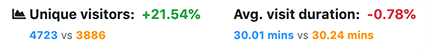
If the range comparison is in place instead, each list item shows the change in percentage of the corresponding metric between the two periods and the total values. The percentage is displayed in green if the performance is better in the current period with respect to the previous one and in red otherwise:
Metrics showing the  icon to their left can be clicked to plot the detailed behavior over the time interval in the main chart.
G View-specific content
The bottom right section of the interface is specific to each view (except the Overview) and it features the content described below, accessible from the link buttons at its top.
Please note that even if range comparison is active, this section only shows the main range data.
» Demographics
The Demographics tab allows filtering data by geographical origin of visitors. The country names are retrieved by geolocating the IP addresses of the visitors (see Data collection - Visitors geolocation).
Five main metrics are available: Visits, Unique visitors, New visitors, New visits % and Average visit duration.
The Location view shows the metrics in tabular form, split by country name, together with the percentage with respect to the overall value. Click on a row to set the filter for the whole tab to the corresponding country.
The Top Countries view shows the top ten countries in descending order for the metric selected in the dedicated dropdown. Click on a bar to set the filter for the whole tab to the corresponding country.
The Map Overlay view shows a world map with countries colored on the basis of their ranking for the metric selected in the dedicated dropdown. Move the mouse over a country to get the metric value and click it to set the filter for the whole tab.
» Technology
The Technology tab allows filtering data by client platform and version. These two parameters are based on the values passed to the setClientDetails() method of the client API (this one, for example). If the method is not used, default API values are displayed (usually the platform id only, without version number).
The same metrics of the Demographics tab are available for this tab.
The Client Types view shows the metrics in tabular form, split by client platform and version, together with the percentage with respect to the overall value. Click on the arrow in front of the platform name to expand it and show the existing versions. Click on a row to set the filter for the whole tab to the corresponding platform or version.
The Top Clients view shows the top ten client versions in descending order for the metric selected in the dedicated dropdown. Click on a bar to set the filter for the whole tab to the corresponding client platform; click again on a bar to set the filter to the client version.
» Application
The Application tab allows filtering data by SmartFoxServer Zone. The Zone names are parsed from the log entries, so they migth not correspond to the current Zones configured in the server (see the Zone Configurator module) in case old Zones have been removed.
The same metrics of the Demographics tab are available for this tab.
The Server Zones view shows the metrics in tabular form, split by Zone name, together with the percentage with respect to the overall value. Click on a row to set the filter for the whole tab to the corresponding Zone.
The Top Zones view shows the top ten Zones in descending order for the metric selected in the dedicated dropdown. Click on a bar to set the filter for the whole tab to the corresponding Zone.
» Exceptions
The Exceptions tab displays the errors and warnings logged at runtime on the server side.
The Exceptions Ranking view shows the total number of warnings and errors, split by exception type, in descending order together with their percentage with respect to the overall number. Click on the arrow in front of the exception type (WARN or ERROR) to expand it and show the exceptions. Click on a row to set the filter for the whole tab to the corresponding exception.
The Errors vs Warnings view shows the percentage of errors and warnings with respect to the total number of exceptions logged.